The Retina-pocalypse Passes
After a few minutes with the new high-resolution iPad it’s obvious Retina-grade assets matter, but when they matter depends.
High-resolution photographs look spectacular on the new iPad, but standard-resolution photos look surprisingly good considering. I wouldn’t describe them as lacking quality, but smooth rather than crisp. Held 16+ inches from your eyes, the difference is almost imperceptible for larger photos. Crisis averted. Good show, gents.
Not so fast. The letdown happens when graphics containing line art or words are scaled up. They look dodgy, and the gaze is drawn to these crunchy edges. PNGs unfortunately scale with rough chunks.
Progressive enhancement covers the gap. For content-type images, Scott Jehl released a promising <picture> polyfill for declaring multiple image sources yesterday. Icon-type images are usually referenced via CSS where it’s easy to supplant @2x assets using media queries.
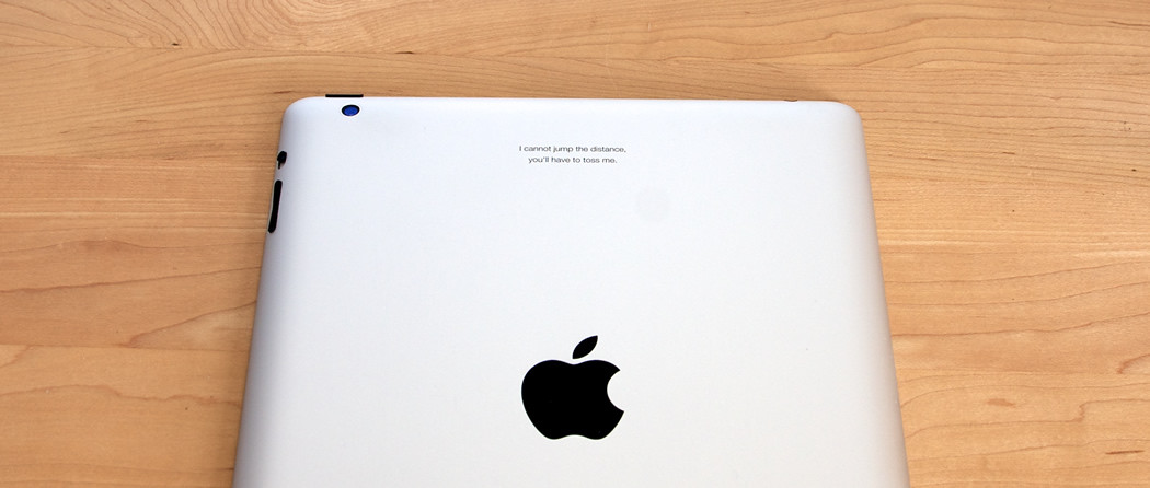
I think the storm is weathering. And yes, my iPad is named Gimli.
