Responsive Design for Ning
Ning announced a design competition for their social network platform on March 10. The prize was $10,000 and dinner with a panel of designers worth $10k more. There was just one catch.
I hadn’t heard about it until my morning Twitter reading on April 13. The entry deadline was April 15 at 5pm Pacific time. Having client work booked and given the short timeline, the higher risk/reward of an experimental design seemed logical.
Tinkering with CSS3 media queries and Lettering.js is something I’ve wanted to do for a while. So I set to work injecting responsive design and radical typography into Ning.
Responsive blitzkrieg
Almost one year ago Ethan Marcotte wrote Responsive Web Design for A List Apart. It was intriguing but just nice to have I thought—after all, a proper computer had a big screen and mobile devices had pinch/zoom. I filed it away under “fluid layout techniques.”
Then Jeremy Keith‘s barrage of projects using media queries and arguments for responsive design changed my mind. I owe him pints for weaving the broader discussion of viewpoints I would have missed like Luke Wroblewski’s Mobile First and this gem:
We can now design effective adaptive layouts that respond to their environment. If these layouts are based on a system that defines its ratios from the content, then there is connectedness on two levels: connectedness to the device, and connectedness to the content.
No more mistaking responsive design for a technique, it’s our discipline in the purest form yet. Even if Andy Clarke doesn’t care, we can agree it’s the way forward.
Mighty Kong
Being new to Ning, I thankfully found the documentation brief and informative but they didn’t provide any sample data to populate a sandbox network. Designing for containers in lieu of content is poor form. Since creating faux-content was unavoidable, I had some fun with it.
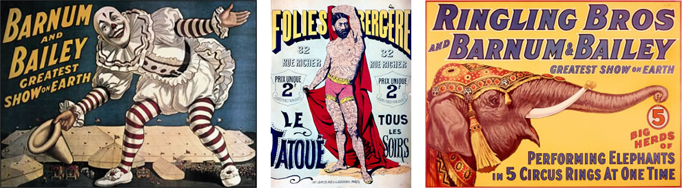
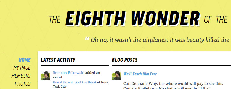
Inspired by the 1933 classic film King Kong, I based the content and design on its familiar fiction: the unveiling of The Eighth Wonder of the World. I researched traveling circus posters from the early 20th century for period-correct ideas.
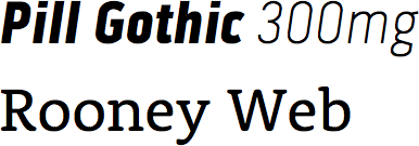
TypeKit furnished Pill Gothic 300mg for headlines and Rooney Web for paragraphs. Word-level control of the header was possible with Lettering.js which lets it reflow as the viewport scales.
After coercing the fixed layout and content into responsive measures I was short on time for typographic adjustments. The text-level CSS could use some attention.
Making Ning responsive
All themes inherit a 982px fixed-width layout and Ning’s design tools don’t make it easy to change that. The built-in CSS editor strips all media queries, forcing the hack of embedding of an external stylesheet with JS.
var theHead = document.getElementsByTagName('head')[0];
var newCss = document.createElement('link');
newCss.rel = 'stylesheet';
newCss.type = 'text/css';
newCss.href = 'http://cdn.gravitydept.com/ning/override.css';
theHead.appendChild(newCss);
This workaround created a few problems. The Ning Design Studio heavily uses LESS CSS to abstract properties to variables. This simplifies minor customizations, but complicates development of original themes. Rather than overriding an existing theme, Ning should offer an unstyled boilerplate option for developers. Since LESS is processed before my vanilla CSS (with media queries intact) is applied, I ignored the LESS editor to speed up development.
Working backwards
Retrofitting media queries ignores the ideal practice of starting with fluid measures. In fairness Ning wasn’t designed for this. My experiment was more akin to field surgery, or an anti-pattern for responsive design. I wanted to get my hands dirty and fail fast, i.e. learn things.
Ning uses a modular CSS grid with 2–3 regions that sometimes have internal columns. The combination of finite units and stacked classes made the conversion to fluid units tenuous. The end result is functional but somewhat inelegant.
My media queries shaped up like so:
/*
Global styles
Overrides for Ning's LESS
*/

@media only screen and (max-width: 1024px) {
    /* Everything is fluid */
}

@media only screen and (max-width: 1161px) {
    /* Shared black navigation bar */
}

@media only screen and (min-width: 1025px) and (max-width: 1161px) {
    /* Standard, uses fixed Ning proportions */
}

@media only screen and (min-width: 1162px) {
    /* Extra wide, navigation moves to left */
}
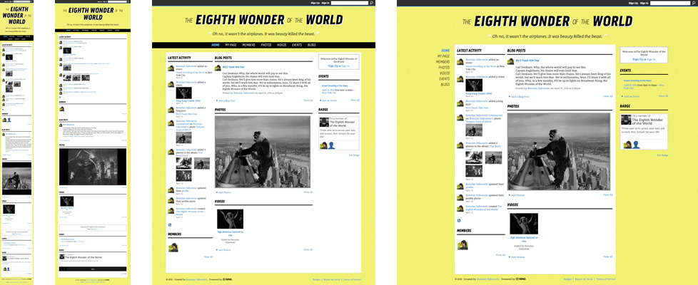
Desktop screens (above 1024px) retained Ning’s fixed layout for simplicity. On wide screens (above 1162px) the navigation repositions and scrolls with the content. The inner page narrows to center the content visually and the footer shifts to match. The lower range (under 1024px) was converted to fluid measures after finishing the desktop styles. Lastly global/override styles were extracted and moved outside the media queries (for older browsers). If I had more time, creating 480px and 768px intervals would have been next.
Working backwards from desktop to mobile is definitely the wrong approach. Mark Boulton’s succinct strategy has my favor:
Start designing from the content out, rather than the canvas in.
After the deadline I used a friend’s iPad for some guerilla usability testing. The media query at 1024px was too high excluding landscape orientation from using the intended rules. Easy to fix, but illustrative: test on real hardware or fail.
Proof of concept
My goal was to experiment with media queries to show Ning’s potential rather than create a marketplace-ready theme. Overriding the platform’s CSS constraints and fixed layout is hard to justify ad hoc. Ideally responsive design principles will become part of Ning’s core, which would be a fun project to work on.
I plan to release my Eighth Wonder design on Ning’s upcoming Theme Marketplace sans media queries. Ultimately this will be more maintainable and user-friendly.
My sandbox network won’t be around forever, but while it lasts you can view it at Eighth Wonder of the World. For posterity, this video shows the media queries in action:
Ning deserves kudos for avoiding a purely speculative competition and ensuring the entrants could monetize their work and retain copyright.
Winner’s circle
From twelve finalists, I made the podium in third place and won some enviable prizes:
- $1,000 cash
- Apple LED Cinema Display 27-inch
- Ning Pro one-year subscription
- Trip to NYC for dinner with the judges
I’m humbled and excited to trade words with Dan Cederholm, Brian Hoff, Ethan Marcotte, Elliot Jay Stocks, Khoi Vinh, and Luke Wroblewski.

Finally, many thanks to Ning for organizing the competition.