Skinny Ties and Responsive eCommerce
Skinny Ties has produced and sold neckwear since 1971. GravDept redefined the company’s creative and technical direction to propel shopping on every device. This is your introduction.
For the last year, I have focused on responsive eCommerce — not mobile commerce — but on strategies that consider all devices. Since my presentation on responsive design at Magento Imagine, I’ve been rather silent on the subject while digging the trenches. I’m proud to further advocate the responsive approach and present Skinny Ties for consideration.
The remaking of Skinny Ties
Skinny Ties gave me an uncommon freedom to simultaneously reinvent the brand’s identity and develop a future-friendly platform to carry the business forward.
Responsive design
Responsive design is how Skinny Ties adapts to fit any shaped device. Transitions between breakpoints were carefully honed from the hierarchy, density, and shape of content. Try resizing your browser to watch elements scale, shift, and snap into place. All interactive elements were built with touch and click usage in mind, which keeps the interface consistent and compact.
Performance
Balancing performance, quality, and maintainability was a high priority. We continually evaluated techniques for deferring, contextually loading, and scaling assets before finding a compromise within Magento’s constraints and our content goals. An uncached, initial page load is 210 KB (63% smaller than the former site). It’s not perfect, but it’s a snappy start for a device-agnostic frontend.
Multi-faceted navigation
I rebuilt the store’s information architecture from the product-level outward. Every tie has structured attributes for width, length, color, fabric, and pattern. Open-ended navigation creates multiple entry paths for every product and enables refining by any attribute at any time. This was a huge win for discoverability.
Gorgeous photography
Consistent, bold photography is central to Skinny Ties’ content strategy and composition was tightly controlled. I created comprehensive style guides for shooting and editing that defined standards for scale, orientation, angularity, white space, ambient brightness, and light hardness. The results are stunning, especially on HiDPI tablets.

A monolithic Magento upgrade
Skinny Ties was three years and four months (16 releases) behind the Magento core. Their former developer didn’t prepare them for maintenance budgeting and it bit hard. When I became involved, it wasn’t cost-effective to patch the obsolete frontend and resources for cleaning the slate weren’t available.
Taking my council and a calculated risk, Skinny Ties favored the long-term. They deferred resources for the opportunity to undertake a transformative project, and swept past 40 months of Magento updates by replacing the entire codebase with modern foundations. Proper maintenance procedures were instilled to restart strong and prevent a relapse.
The security, stability, and performance benefits of running Magento’s latest code can’t be understated. On its own this would have been a major success.
And it launched 2.5 weeks ago
The revamped experience has been live since October 7th. We launched quietly to measure organic users’ interactions. I also demoed it to a handful of smart folks at Brooklyn Beta for feedback. We’ve been analyzing, iterating, and plotting next steps since the soft-launch.
Splish Splash
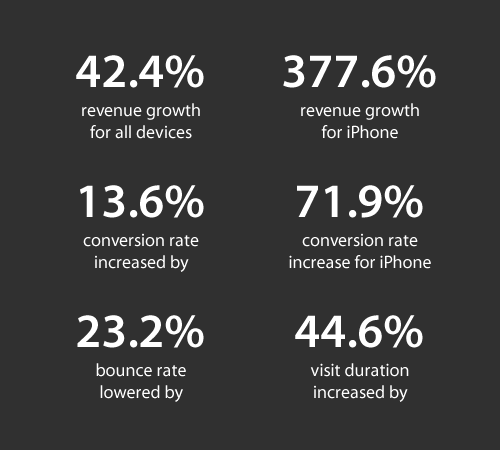
By the numbers, modernizing Skinny Ties is already proving a watershed success. The normalized figures versus the prior three months are staggering:

I drafted a bevy of techniques/observations I’m preparing to compile and share, yet the project was not all sunshine and roses. Its making was equally fraught with uncertainty, ideas masquerading as solutions, and tension. It was not business as usual. I’m looking forward to airing my observations and discussing the non-linear demands this work stretches us to embrace.
Visit SkinnyTies.com
Explore the site on your phone, tablet, or computer; then pick out a skinny tie for yourself and hit the town.

